

Rack & Return
Barcelona · Spain
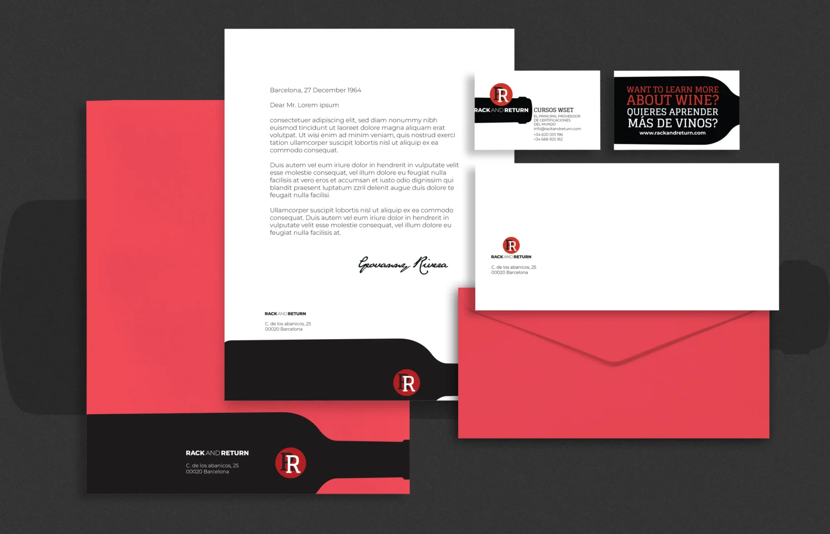
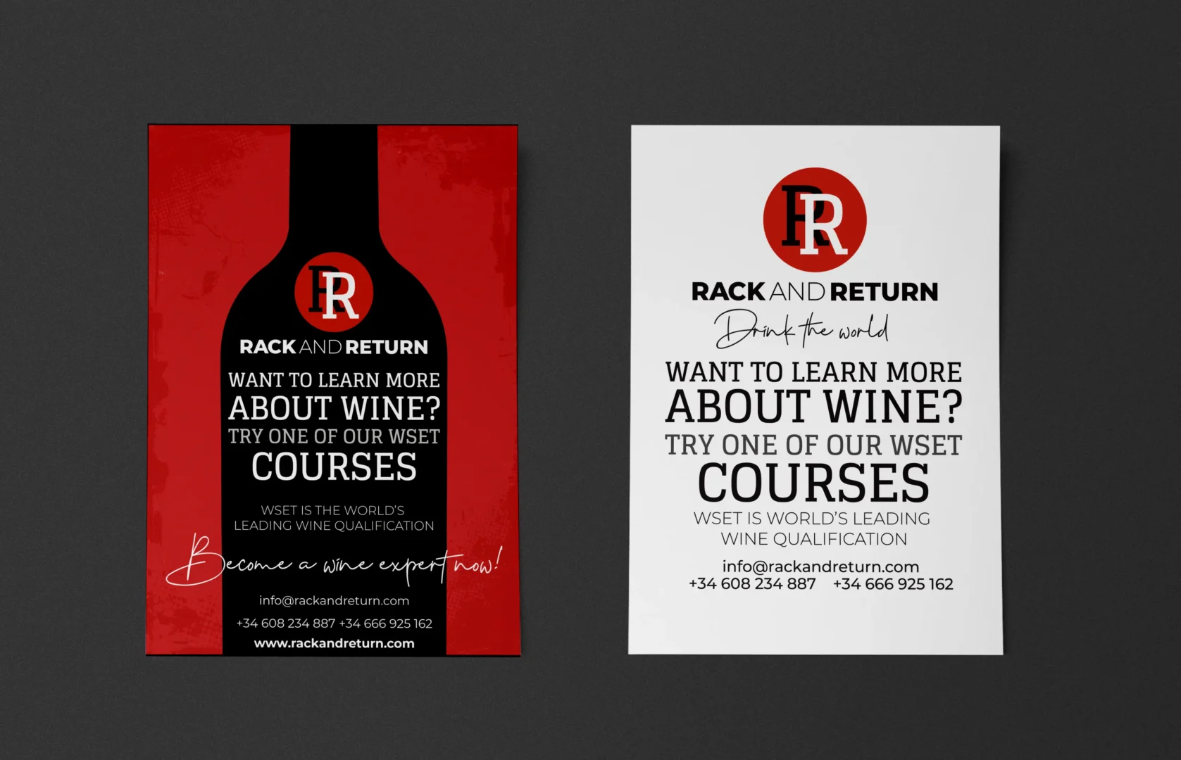
For Rack & Return, a company specialising in WSET wine courses in Barcelona, I developed a bold brand identity using a striking palette of red, black, and white.
This vibrant colour scheme reflects both the energy and professionalism of the institution while maintaining a sense of modernity and sophistication. The clean typography and strong contrasts create a memorable and impactful visual presence, aligning with the brand’s focus on high-quality wine education.