
Atavus Priorat
Gratallops · Priorat · Spain
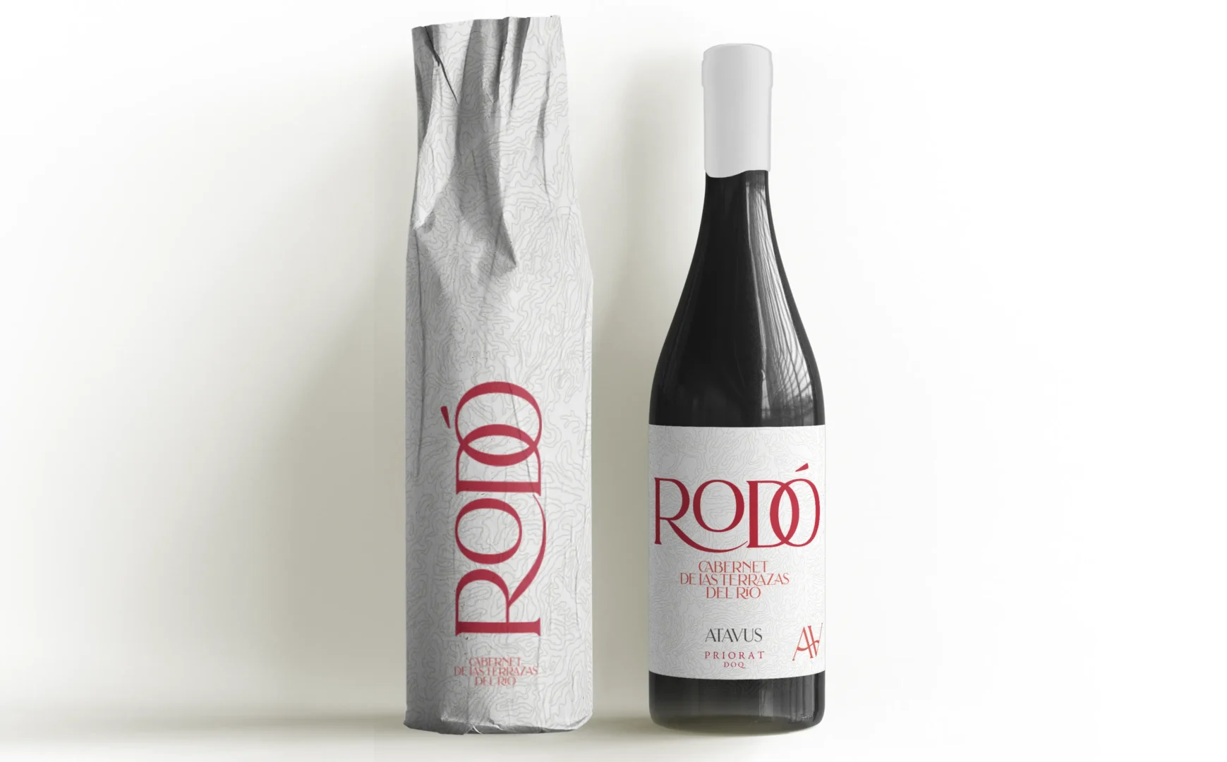
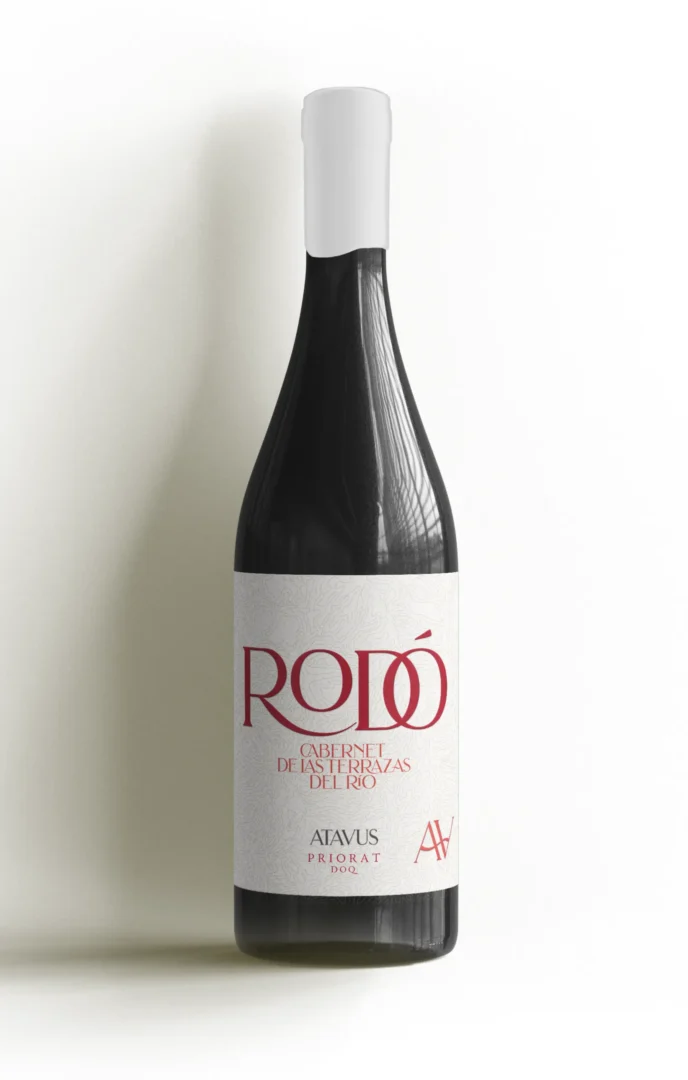
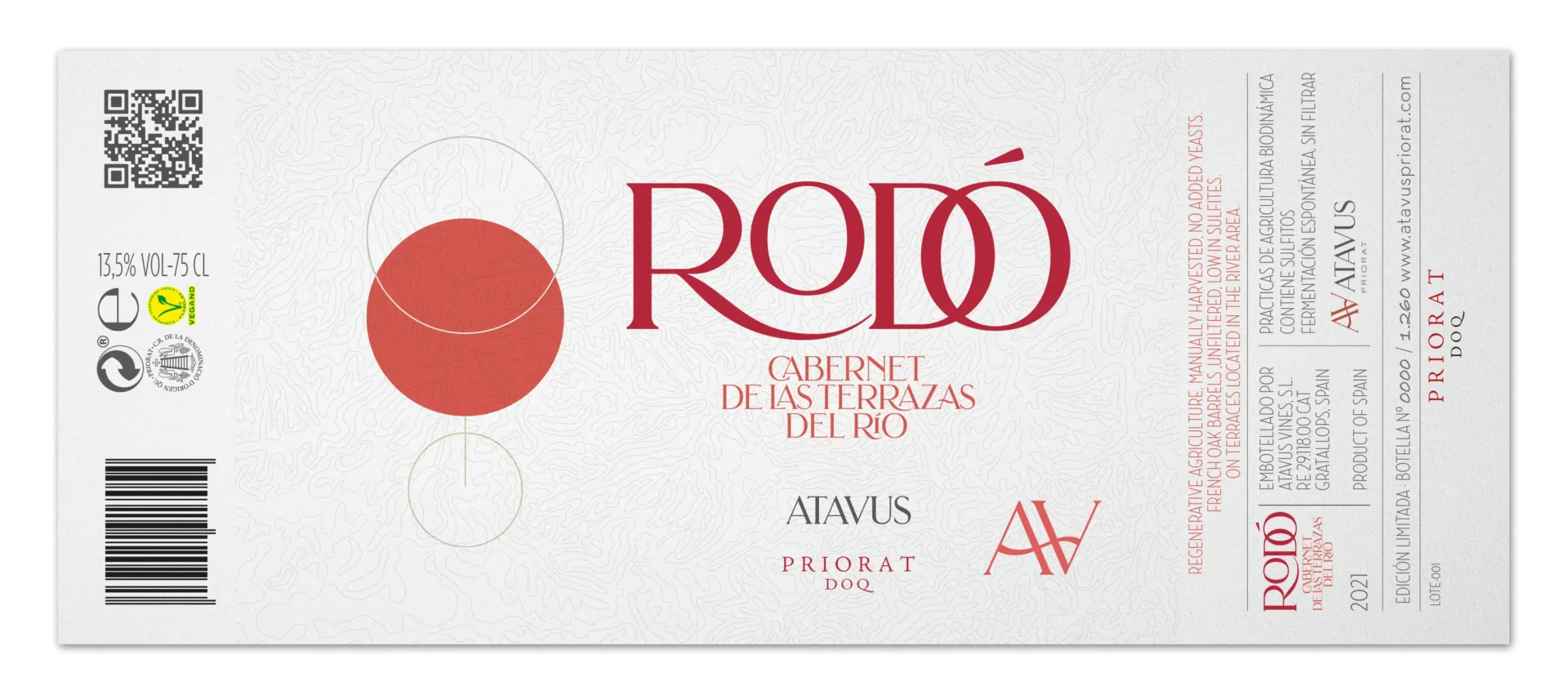
The label design for Rodó (Catalan for “Round”), a bold, full-bodied natural red wine, was created as part of the branding for the launch of the new Atavus Priorat winery.
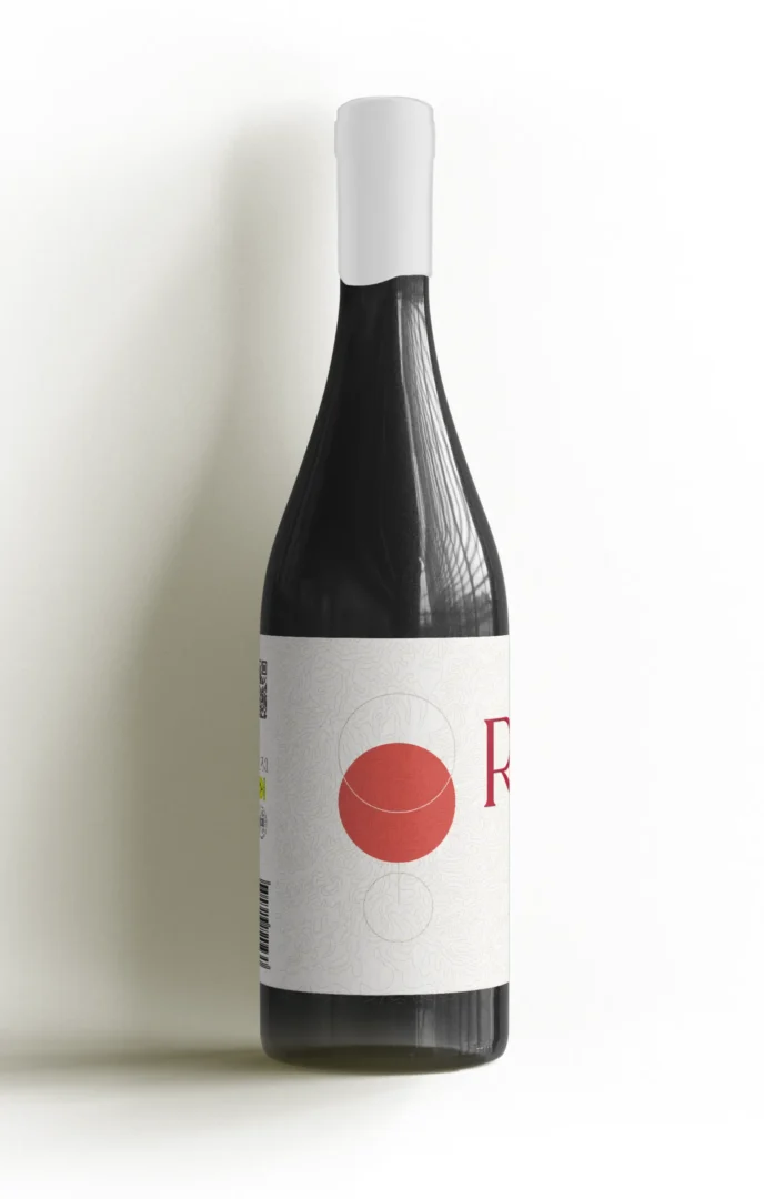
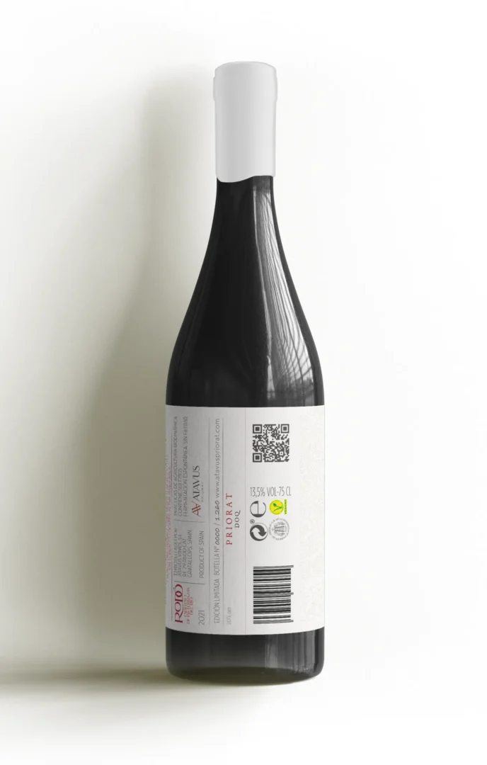
The label features a logo with playful typography, aligned with the winery’s new corporate style. A topographic map forms the background, symbolising the deep connection between the wine and the land. On one side of the continuous label, pictograph of a full wine glass, composed of circles reinforcing the theme of roundness both in design and flavour.