

Atavus
Priorat . Spain
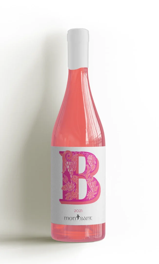
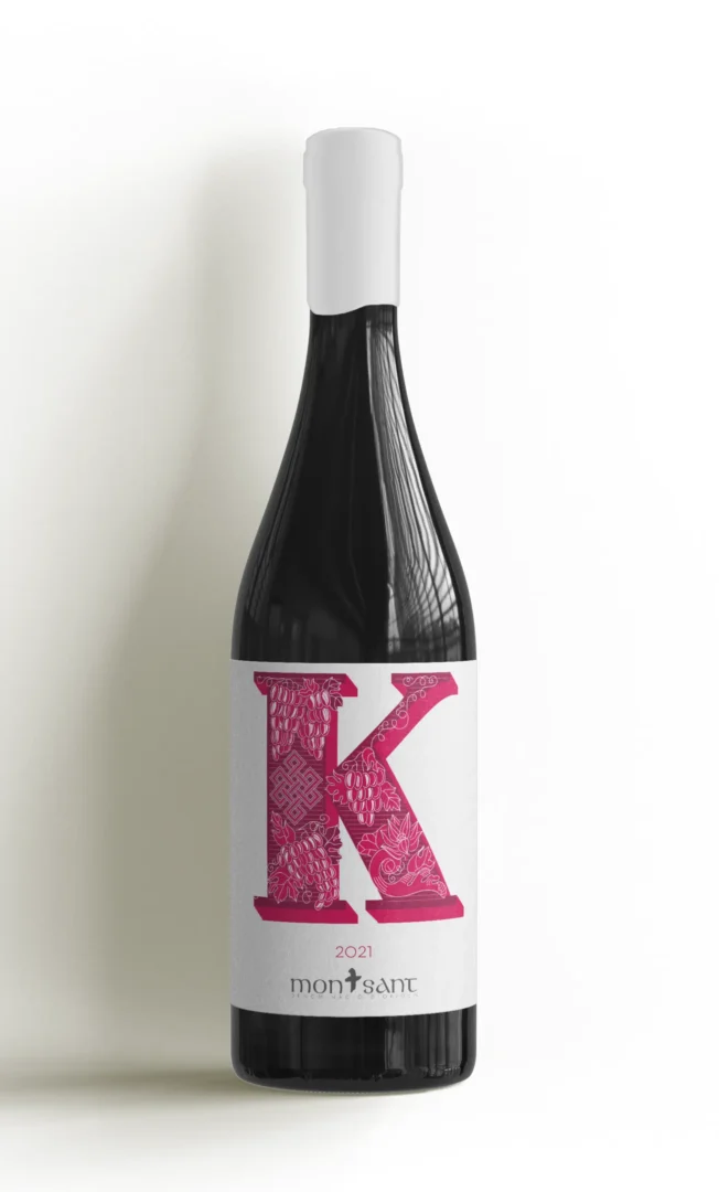
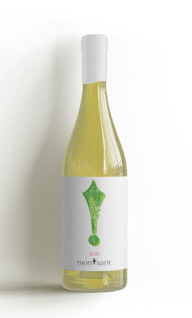
The BK! wine label series for Atavus’ Montsant wines brings an inventive twist to the shelf. Designed to stand out as a trio, each bottle—white, red, and rosé—features one letter of “BK!” so that, when placed together, they spell out the name in bold. This concept makes a memorable first impression, enticing buyers with its unique modularity.
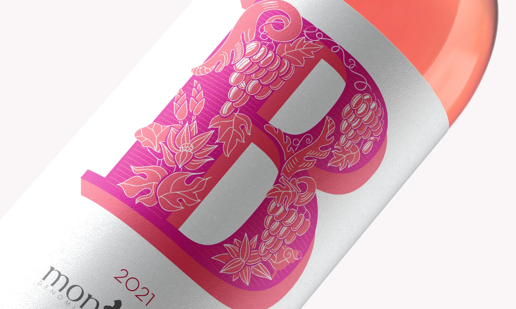
Inspired by Louis John Pouchée’s 1820s letterforms, each label intricately intertwines BK initials with karma symbols, grape clusters, and flourishing vines. The vivid, almost fluorescent color palette exudes playful energy, capturing the essence of “Buen Karma!” (Good Karma) and creating a vibrant connection between Atavus’ heritage and a fresh, contemporary identity.