

Batonnage Wine Company
Barcelona Spain
Label design
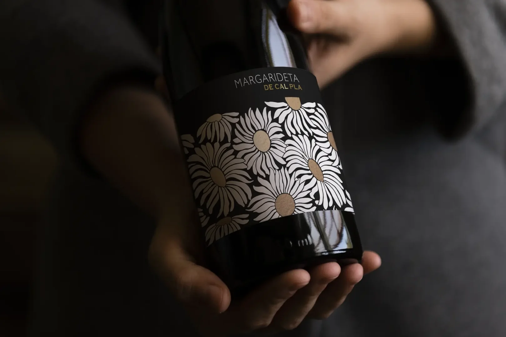
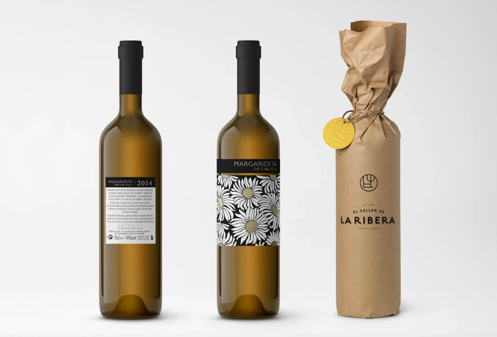
The elegant wine label design for “Margarideta de Cal Pla” embodies the essence of this exquisite wine. The name “Margarideta,” a diminutive of “Margarida,” means “she who is like a pearl” or “she who hides her beauty,” reflecting the wine’s delicate character. This clear, clean white
wine surprises with its depth and charm, much like the label itself. Featuring playful daisies (margarides), the design captures the lighthearted yet sophisticated nature of the wine, inviting drinkers to discover the beauty within.