

Tigre y Panda
Barcelona · Spain
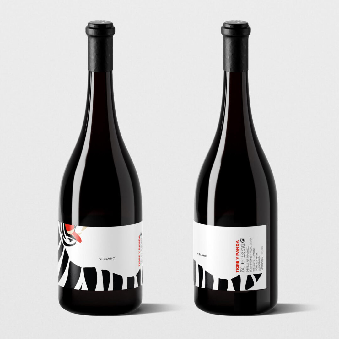
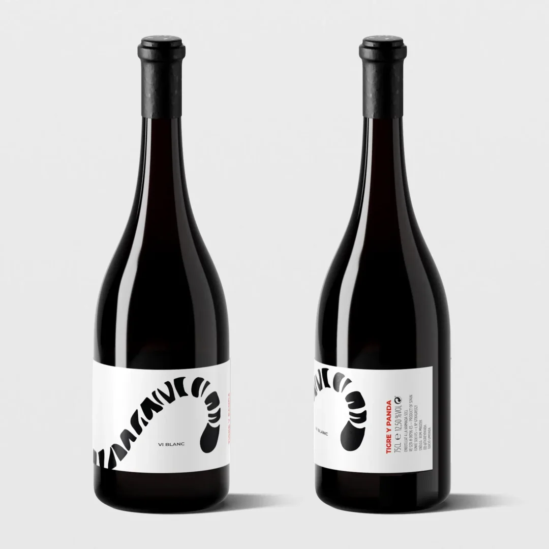
For Tigre & Panda wine packaging design, I created a bold, black-and-white label design with a hint of red for contrast. The design features a close-up tiger illustration, split across two labels: one with the tiger’s head and the other with its tail. When placed side by side, the bottles reveal the full tiger illustration.
Each label wraps around the bottle, including all required front and back information while maintaining a sleek and modern look. The design combines sharp visuals with functionality, standing out on the shelf and inviting interaction.