

Battonage Wine Company
Barcelona · Spain
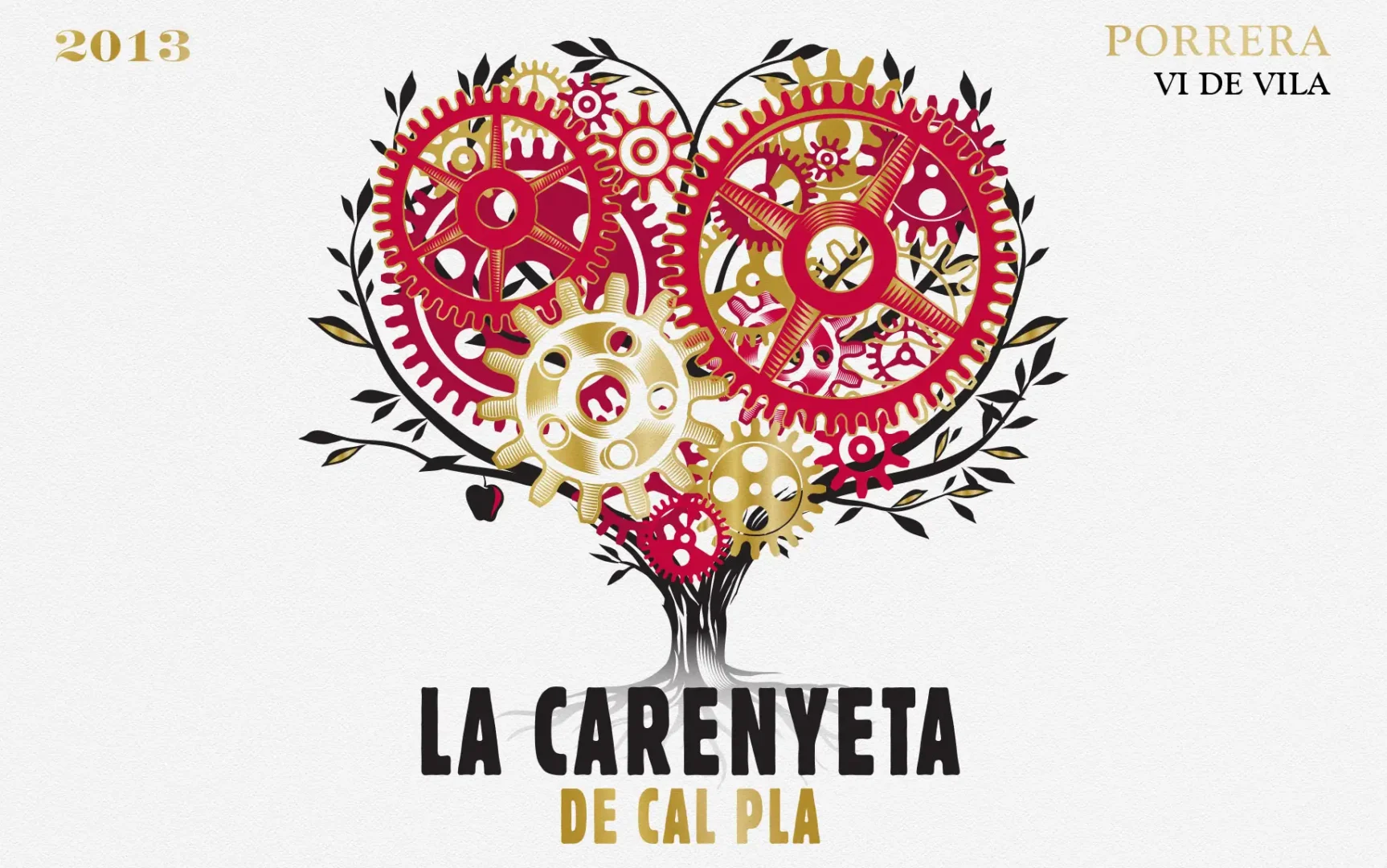
Heartfelt Carenyeta de Cal Pla label design
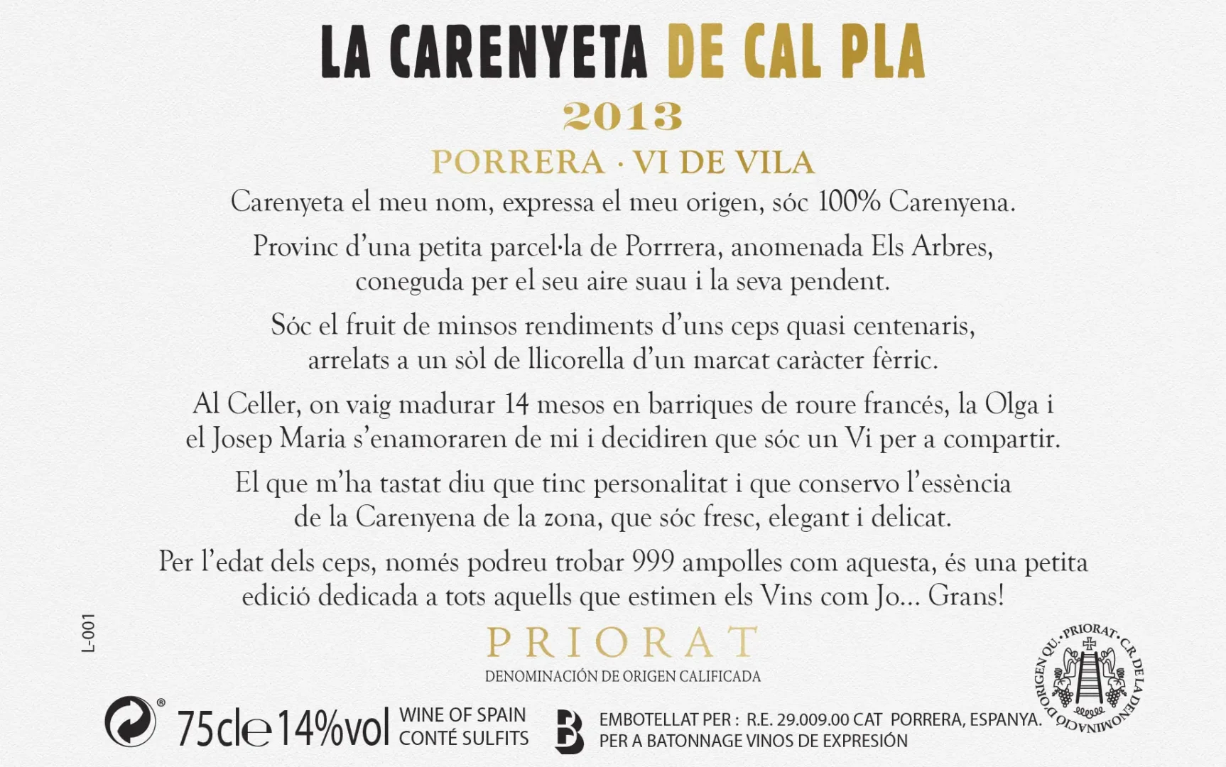
The Carenyeta de Cal Pla label design tells a story as rich as the wine itself. The name is a playful fusion of the Cariñena grape and the word Cariño (affection), capturing the essence of the wine—crafted with care, passion, and a deep connection to its roots.
The label features a visual narrative that marries artistry with meaningful symbolism. Central to the design is a striking grapevine tree of life, intricately illustrated to represent growth and connection. Within its branches, cogs of clocks are seamlessly integrated, forming a heartfelt symbol that beautifully conveys affection and timeless craftsmanship. The colour palette complements the design’s elegance, while the overall layout balances modern aesthetics with rustic charm. This label not only tells the story of the wine but also serves as a piece of art that reflects the dedication, creativity, and heartfelt passion behind its creation.