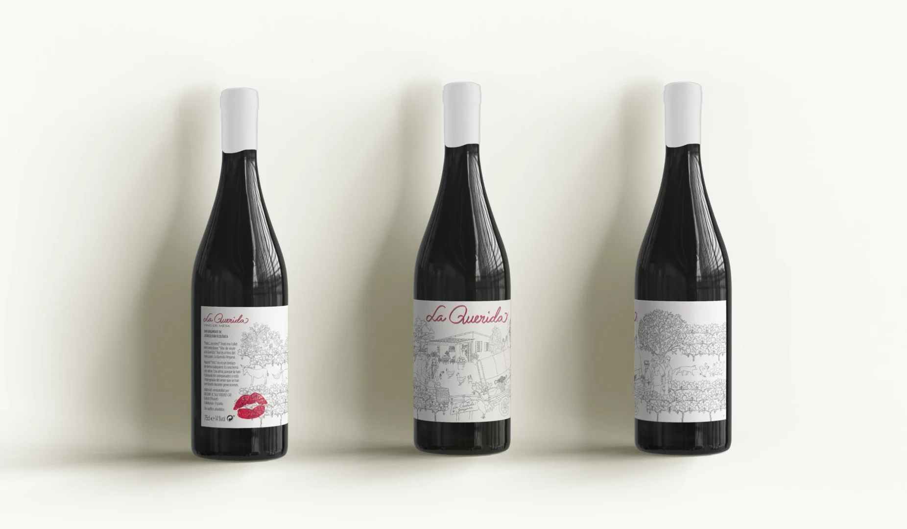
“Father… where were you?
With a playful wink, he replied: I’ve just come from visiting La Querida (Catalan for lover). That is my father’s land, La Querida Pinyana. This land is no ordinary patch of earth. It is soil with a soul—one shaped by the hands of our ancestors, steeped in the love they sowed, season after season, across generations.”
The packaging design for La Querida, packaging tells the story of the family estate where the wine is produced. Inspired by heritage and tradition, the design captures the soul of the land—one shaped by the hands of ancestors and filled with the love sown through generations.
The illustration showcases the estate’s vineyard, the surrounding vegetation, animals, harvest tools, and the people who work the land. The label reflects more than just the product—it celebrates friendship, history, connection, and the artistry of winemaking. Through this design, each bottle carries a story rooted in tradition and the spirit of La Querida Pinyana.
branding, graphic design, illustration, Packaging and ilustration
“Father… where were you?
With a playful wink, he replied: I’ve just come from visiting La Querida (Catalan for lover). That is my father’s land, La Querida Pinyana. This land is no ordinary patch of earth. It is soil with a soul—one shaped by the hands of our ancestors, steeped in the love they sowed, season after season, across generations.”
The packaging design for La Querida, packaging tells the story of the family estate where the wine is produced. Inspired by heritage and tradition, the design captures the soul of the land—one shaped by the hands of ancestors and filled with the love sown through generations.
The illustration showcases the estate’s vineyard, the surrounding vegetation, animals, harvest tools, and the people who work the land. The label reflects more than just the product—it celebrates friendship, history, connection, and the artistry of winemaking. Through this design, each bottle carries a story rooted in tradition and the spirit of La Querida Pinyana.